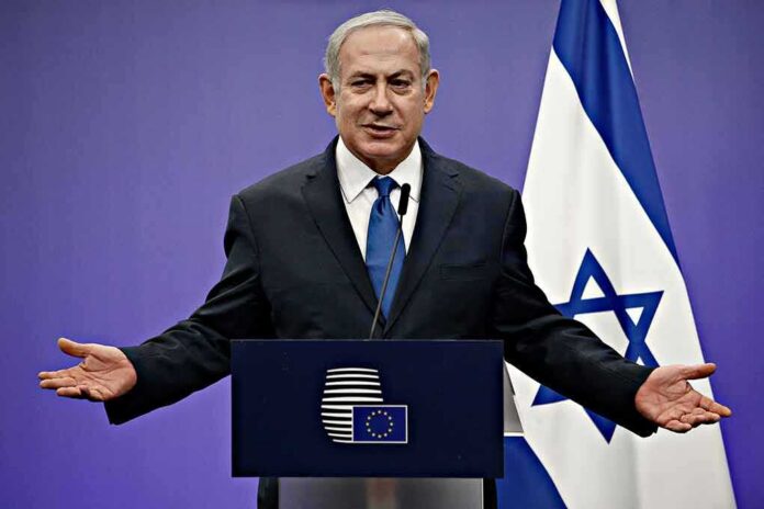
A public map shown by Israel’s leader marked Somaliland and Puntland as “friendly,” fueling fresh debate over shifting Middle East and Red Sea alignments.
Story Snapshot
- Netanyahu’s briefing displayed a map labeling Somaliland and Puntland as friendly to Israel and the United Arab Emirates.
- The map separated a core Israel–United Arab Emirates “Hexagon” from wider “friendly” areas, not formal allies.
- Reports trace the map’s design to a German foundation study released months earlier.
- Critics argue Puntland has no formal ties with Israel and object to placing armed factions in the “friendly” category.
What Netanyahu’s Map Actually Showed
Reporters present at the October 18 security briefing say Benjamin Netanyahu showed a “Geopolitical Alliances in the Middle East” map. The legend used light blue to mark places considered friendly to Israel and the United Arab Emirates. Somaliland and Puntland appeared in that category, along with others in the region. The map drew sharp attention because it split Somalia from Somaliland and Puntland. It also grouped rival blocs and outlined a core Israel–United Arab Emirates “Hexagon” as separate from the wider circle.
Coverage stressed the difference between a core alliance and a friendly sphere. Israel and the United Arab Emirates formed the dark-blue core, while places like Somaliland, Puntland, Ethiopia, and Greece were shown as friendly but not treaty allies. That distinction matters. It shows the display as an assessment of alignments, not a claim of legal pacts. This reading tracks with how modern regional ties often work: flexible, real, but informal and sometimes quiet.
Who Drew It And Why That Matters
The New Arab reported the slide carried the logo of Friedrich-Ebert-Stiftung, a German foundation. It said researchers Marc Saxer and Marcus Schneider first published the graphic in May 2026. That detail matters because it shows the image was an outside analytical product, not a new Israeli intelligence map. No Israeli method notes or source files were released with the briefing. That gap lets critics say the display was political or too broad.
The broader layout grouped rival coalitions. Reports described labels like a “Sunni Diamond,” an “Axis of Resistance,” and the Israel–United Arab Emirates “Hexagon.” Somalia’s federal side was shown in a different friendly sphere than Somaliland and Puntland. That layout underlined maritime and Red Sea stakes and the tug-of-war over ports and sea lanes. It also matched United Arab Emirates interest in Horn of Africa ports, which some analysts link to the friendly tags for Somaliland and Puntland.
Points Of Dispute And Why They Resonate
Commentary pushed back on parts of the map. Harici reported that Puntland has no diplomatic ties with Israel and supports a functioning Somali federal system. It argued Puntland’s placement reflected ties with the United Arab Emirates more than any direct Israeli link. Middle East Eye said the map even placed territory held by Sudan’s Rapid Support Forces in the friendly category, while the United Arab Emirates has officially denied backing that group. Those choices added political heat to the display.
THE MESSAGE FROM OVDA: WHEN DETERRENCE MEETS GEOPOLITICAL REALITY
U.S. Defense Secretary Pete Hegseth’s unannounced meeting with Israeli Prime Minister Benjamin Netanyahu at Ovda Air Base was more than a diplomatic courtesy call. When high-level strategic discussions unfold… pic.twitter.com/AATQw3LxD0
— Isaac Halevi 🎙️🌐 (@Isaac_Halevi) October 20, 2026
Somali outlets noted Mogadishu rejected Israel’s recognition of Somaliland and viewed the map as a sovereignty issue. Newsweek quoted an analyst who said the slide shows regional pushback as much as alliance gains. Israel’s opposition figure Gadi Eisenkot called parts of the doctrine slogans, not a worked-out plan. Still, the core fact stands: the map showed how Israel’s leader and his team view emerging partners and routes, even if many ties are informal and fluid, not treaty-grade.
Why This Matters For U.S. Readers
American interests run through these sea lanes and alliances. Iran’s reach, Turkish moves, and chaos in Sudan all touch vital trade routes and energy costs. Informal alignments can help secure shipping and push back on hostile actors. But unclear lines also risk missteps and mixed signals. The Trump administration works with Israel and Gulf partners to keep seas open and fight terror. That job gets harder when maps mix states, regions, and militias in one friendly shade.
Conservatives should track two things. First, the map shows a race to lock down the Red Sea and the Gulf of Aden. Ports, pipelines, and cables are targets. Second, critics use the lack of formal documents to claim bad faith. The smart path is simple: insist on clarity, real results, and daylight where possible. Support allies against Iran’s proxies. Keep pressure on terror groups. But demand that any U.S.-backed framework respect sovereignty and avoid empowering warlords or separatist violence.
What To Watch Next
Watch for any official Israeli papers that explain the map’s categories and data. Look for signs of practical follow-through, like port security projects, maritime patrols, or joint drills. Check if Somaliland and Puntland issue clear statements on their roles. Track whether Somalia, Egypt, Saudi Arabia, Pakistan, or Turkey respond to the map’s bloc labels. Finally, judge outcomes by hard measures: safer lanes, fewer attacks at sea, and reduced reach for Iran and its partners.
Sources:
zerohedge.com, somaliatoday.com, harici.com.tr, news-pravda.com, newarab.com, newsweek.com, sunnafiles.com, allafrica.com